The Safe Width Principle: Why Designing for Large Screens Breaks Responsive Layouts
A developer-first perspective on why responsive layouts scale better when anchored to constraint widths like 1280px desktop and 325--350px mobile.
February 12, 2026
In modern web projects, design handoffs typically arrive in two formats: desktop and mobile. These mockups are usually delivered through tools like Figma, with desktop layouts commonly designed at widths 1440px to 1920px, and mobile layouts often designed between 375px and 414px.
After building themes with responsive layouts across many types of sites and platforms, I've consistently encountered a pattern:
Layouts designed at smaller, more constrained widths scale upward reliably. Layouts designed at larger widths often fail when compressed to smaller viewports.
This article explores what I call The Safe Width Principle --- a practical approach to responsive design anchoring based on real viewport behavior rather than ideal display dimensions.
Layouts Expand Better Than They Compress
Responsive design is often treated as a fluid scaling problem. In production, it behaves more like a density management problem.
Layouts constructed under tighter horizontal constraints tend to preserve structure when additional space becomes available. Conversely, layouts built using generous horizontal space often depend on that space in ways that become fragile when reduced.
Expansion as Graceful Degradation in Reverse
From a UX perspective, expansion and compression are not symmetrical experiences.
When a layout expands from 1280px to 1920px, the additional space acts as passive improvement. White space increases, visual noise decreases, and content gains clarity without requiring structural changes.
When a layout designed at 1920px is forced into 1280px, the user experiences active friction. Elements compete for attention, spacing collapses, and hierarchy weakens.
Extra space is a luxury.
Lack of space is a failure condition.
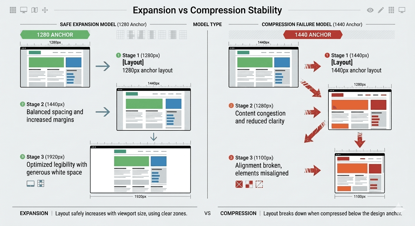
Desktop Design: The 1280px Advantage
When Designs Start at 1280px
Layouts built at 1280px scale upward with minimal structural adjustment. As screen width increases to 1440px, 1560px, 1920px, or ultra-wide displays, expansion usually results in improved spacing and visual comfort rather than inconvenient layout restructuring.
When Designs Start at 1440px or 1920px
When desktop mockups are anchored at larger widths, layouts often rely on whitespace as a structural component. Once those layouts must function at 1280px --- which remains extremely common in real browsing environments --- compression issues surface.
The Reality of Desktop Viewports
While 1920×1080 remains one of the most common monitor resolutions globally, the dimensions of the browser viewport—the actual area available for rendering content—are often significantly smaller.
StatCounter data shows continued, meaningful usage across resolutions such as 1366×768 and 1536×864, reflecting a wide distribution of device sizes rather than a single dominant standard.
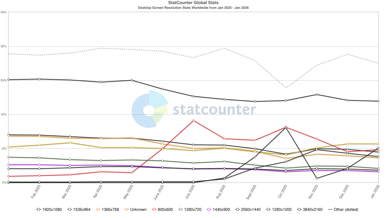
Source: https://gs.statcounter.com/screen-resolution-stats
Large-scale web measurement data further reinforces that effective viewport widths typically fall below full display resolution. Analysis from the Web Almanac (HTTP Archive, using Chrome UX Report data) indicates that desktop layouts cluster around ~1360 px at the 75th percentile, with testing configurations centered on ~1376 px-wide viewports—well below common 1920 px displays (HTTP Archive, 2024; 2022).
This aligns with platform-level behavior: the viewport corresponds to the size of the active browser window and explicitly excludes browser UI chrome (e.g., tabs, toolbars), rather than reflecting the full screen size (Mozilla Developer Network). As a result, real-world viewport widths systematically underrepresent nominal monitor resolutions, particularly when users operate in non-maximized or multi-window environments.
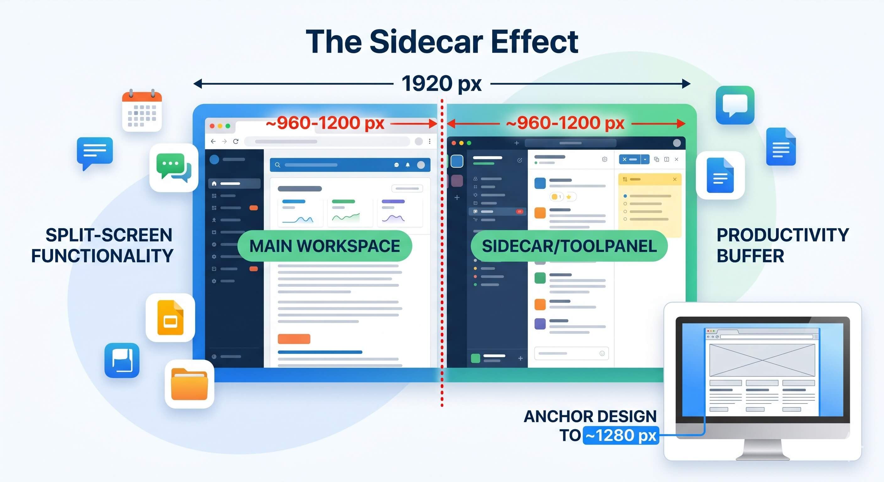
The Sidecar Effect
Modern desktop browsers frequently offer split-tab functionality, and users appreciate the productivity it provides. In split-screen or tiled window scenarios, a 1920 px display frequently yields effective viewport widths in the ~960–1200 px range per window. We need to design for the realities of how users interact with their devices, not just the theoretical maximums.
Designing for ~1280 px provides a practical buffer that accommodates these common constraints while maintaining layout stability across a wide range of real-world usage patterns. Users will always have the option to expand their browser window, but they cannot reliably contract it without encountering layout issues if the design is not anchored to a safe width.
Why Designers Naturally Drift Toward Wider Layouts
I'm not a designer, but I can observe patterns. This phenomenon is not the result of poor design decisions. It is a natural outcome of creative workflow.
When designers have access to more horizontal space, they understandably explore richer layouts, increased column density, and more expressive spacing systems. These choices often produce visually appealing results inside design tools.
The challenge emerges when these design decisions become structural dependencies rather than optional enhancements. As developers, we fill the gap between design intent and implementation reality. When designs are created at widths that exceed common viewport constraints, the resulting layouts often require significant rework to function properly at smaller widths. This creates a disconnect between the design vision and the practical realities of responsive implementation, leading to frustration for both designers and developers.
The Safe Width Principle as a Guiding Framework
The Safe Width Principle encourages designers to anchor their layouts at widths that reflect real-world viewport constraints. By designing for a safe width (e.g., 1280 px for desktop), designers can create layouts that are inherently more adaptable and resilient across a wider range of devices and screen sizes. This approach speeds up the development process, reduces the need for rounds of rework, and ultimately leads to a more consistent and reliable user experience across all devices.
More Blog Posts

December 19, 2025
Practical Ways to Integrate Blockchain in Your Web Stack
A practical guide for web developers on when and how to effectively use blockchain technology in modern web applications.
December 15, 2025
Best Practices: Adding Fonts to Your Website
Learn how to add web fonts the right way with modern best practices for performance, typography, caching, and user experience.

December 14, 2025
How Caching on the Web Works
A practical guide explaining how server cache, browser cache, and modern cache-busting techniques work—plus solutions for WordPress, React/Vue, and static sites.